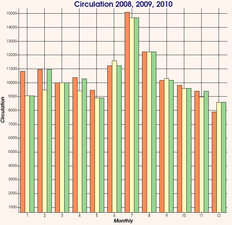
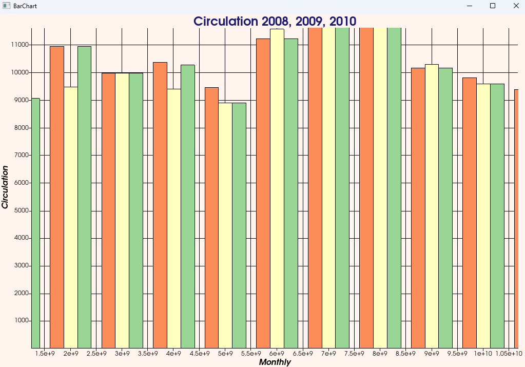
I am trying to create bar charts and I have found that once you reach large enough numbers for either the x axis (bin ranges) or the y axis (bin sizes), the chart no longer shows up as expected. To test this, you can edit this bar chart example from vtk so that each of the data_2008, data_2009, and data_2010 arrays hold doubles instead and then multiple each number within the arrays by 10e5. Likewise, you can edit the x axis values by multiplying each number by 10e8. Below I’ve included some images showing the original bar chart vs the chart using the edited values to show what I mean. Can someone explain why this is happening?
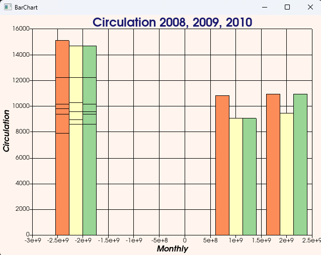
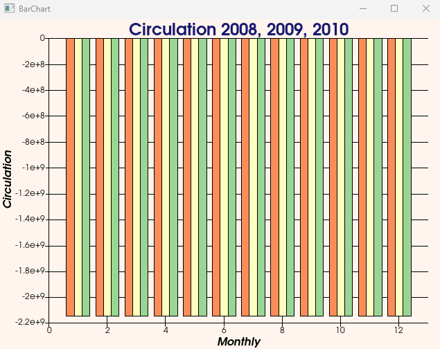
Oh you are correct, that was my bad. That definitely fixes the scaling issues with the y axis. The x axis with the bin ranges still looks pretty screwed up straight off though. The first image is what I get by default when I run the original example with the vtkDoubleArray and the x values multiplied by 10e8. But when I start zooming in a little with the mouse wheel I eventually get the second image
It looks like it’s rendering bars on top of each other. That’s why there are black lines, each black horizontal line is the top of one of the shorter bars that was rendered after a taller bar that was rendered before. Not sure why it ended up yellow instead of orange or green, but that must have something to do with the order of the rendering.
So the question is, why is it rendering multiple bars at the same position?
Yes that is the main problem/question I was looking to get answered. Is there a particular threshold at which this happens? I could of course just use indexes to position the bars along the x axis and use the actual values just as the labels but I am wondering if there is a reliable way to tell when I would have to do this or why I should even have to in the first place.
This is user data coming into our application and so we are at the whim of the user.
This is clearly a bug in the VTK Charting codes that I am sure the VTK devs will work out. If it is not a bug then the API for the charting would need to be updated to reflect the proper magnitudes are data that can be used with the VtkCharts.
Just to add a bit more information, this bug appears with bar charts but not line charts, even for huge values like 1e300 that are close to the limit of what a double-precision float can represent. That narrows down what code might be responsible.
The large values trigger an automatic rescaling of the plot, which is supposed to ensure that it can be drawn accurately with 32-bit floats (which is the data type that vtkPlot uses internally for drawing). However, the rescaling seems to be incorrectly implemented for vtkPlotBar, causing the results that you’ve shown above.