I know this has been asked in the past but I just cant seem to find the posts. How does one get the font for things like the CubeAxisActor to look “nice” on macOS? They are all jaggy on my macOS machine but nice looking on our windows machines? I’ve tried setting the path to a .ttf file but that did not seem to help. I’m really rusty at VTK. Just getting back into is after a long hiatus.
Hello,
Normally, a jagged rendering of text happens when the font size is set to small number. What’s the value are you using?
regards,
Paulo
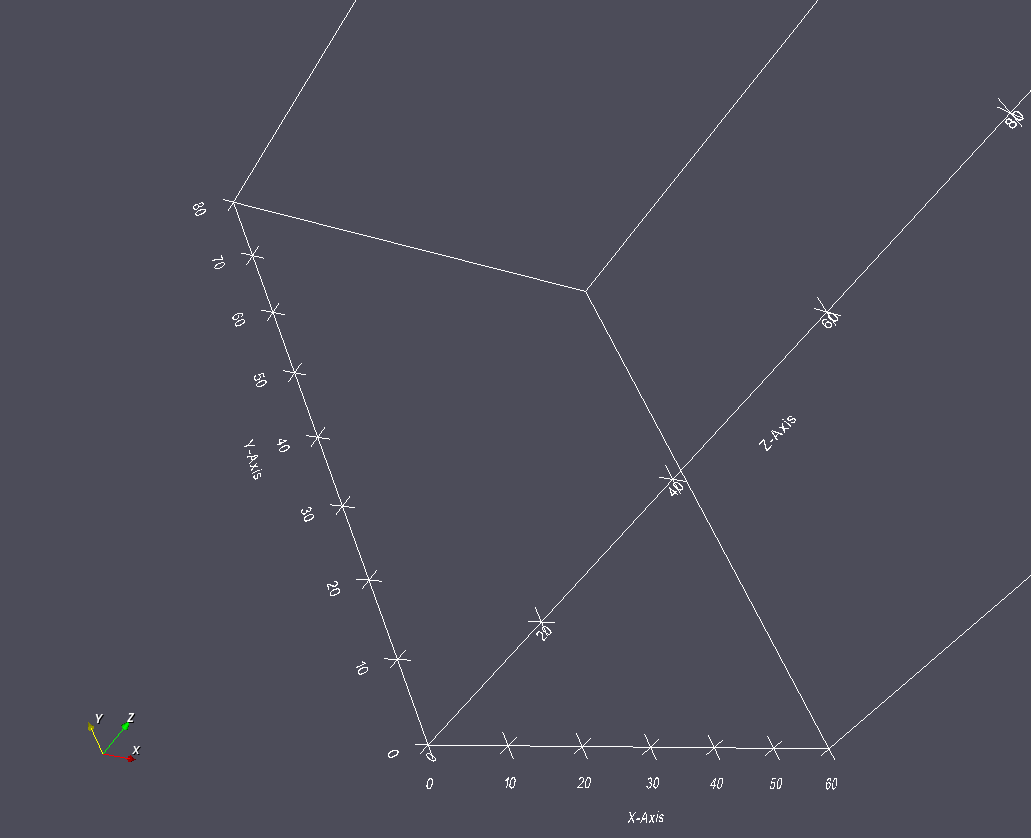
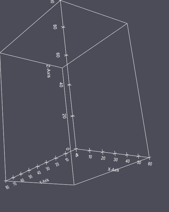
This is the code that I am using:
m_CubeAxesActor->XAxisMinorTickVisibilityOff();
m_CubeAxesActor->YAxisMinorTickVisibilityOff();
m_CubeAxesActor->ZAxisMinorTickVisibilityOff();
m_CubeAxesActor->SetCornerOffset(0.0);
m_CubeAxesActor->SetFlyModeToStaticEdges();
m_CubeAxesActor->SetTickLocationToBoth();
m_CubeAxesActor->GetTitleTextProperty(0)->SetFontSize(20);
m_CubeAxesActor->GetTitleTextProperty(1)->SetFontSize(20);
m_CubeAxesActor->GetTitleTextProperty(2)->SetFontSize(20);20 is a decent font size. Can you, please, post a screen captura of what you’re getting in MacOS?
It seems to me that the entire scene is aliased. Have you explicitly enabled antialiasing?
Yes, multisampled antialiasing (MSAA) yields good-looking results, but some people complain about its performance. As the name implies, it does multiple renderings with small shifts and a smooth average image is taken. In VTK, you can also try FXAA, a fast antialiasing method based on pixel contrast quantification and decision that requires one render pass, but some people complain about its visual results… In my projects, I let it up to the user to choose (FXAA, MSAA or none).
One alternative to this is to use flat axis labels with SetUse2DMode(), the text is less distorted from the 3D projection but you encounter other issues with the label layout being somewhat erratic. I’ve never really liked how the axes are displayed in VTK and elect to grab the projection coordinates and generate my own vector representation when I use plots in publications.
AFAIK the 3D labels are rendered as 3D polygons (which is why they’re affected by pressing the ‘W’ hotkey) and so it’s likely that the jaggedness is related to that. I wonder if the text could instead be rendered as an image texture (similar to how latex is displayed in VTK) which may work better within the rendering pipeline.