vtk chart background shifted towards origin

Hi there,

I was trying out the vtk Charts API in python, following the examples on the wiki (ChartsOn3DScene and LinePlot). I tried to create two charts in the same context scene and would like to use a different background color for each of them (see code to reproduce below). The resulting plot is not what I expected to see though:

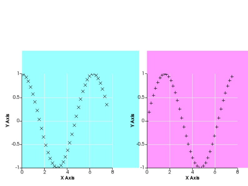
As you can see, the lower left corner of the backgrounds seem to be shifted towards the origin of the charts. I had a look at the plotting code of vtkChartXY and it seems the background is painted using the chart’s Point1. When I printed out the values of each chart’s Point1, it indeed showed the Point1 is actually lying at the origin (the same Point1 as the X axis) instead of lying at the lower left corner of the whole chart (including the labels). Is this intentional or am I missing a different property that has to be set? Any help on how to properly set the background colors of each chart would be highly appreciated!

I’m working on Windows 10, using python 3.7 and the pypi package of vtk, version 8.1.2. Upgrading to the latest vtk version (9.0.1) is not possible at the moment because of this bug.

Code to reproduce above plot:

import vtk
import math

renwin = vtk.vtkRenderWindow()
renwin.SetSize(640, 480)
iren = vtk.vtkRenderWindowInteractor()
iren.SetRenderWindow(renwin)
renderer = vtk.vtkRenderer()
renderer.SetBackground([1, 1, 1])
renwin.AddRenderer(renderer)

chart_scene = vtk.vtkContextScene()
chart_actor = vtk.vtkContextActor()
chart_actor.SetScene(chart_scene)
renderer.AddActor(chart_actor)
chart_scene.SetRenderer(renderer)

chart_left = vtk.vtkChartXY()
chart_scene.AddItem(chart_left)

chart_left.SetAutoSize(False)
chart_left.SetSize(vtk.vtkRectf(10, 10, 300, 300))
chart_left.GetBackgroundBrush().SetColorF(0, 1, 1, 0.4)

chart_right = vtk.vtkChartXY()
chart_scene.AddItem(chart_right)

chart_right.SetAutoSize(False)
chart_right.SetSize(vtk.vtkRectf(330, 10, 300, 300))
chart_right.GetBackgroundBrush().SetColorF(1, 0, 1, 0.4)

table = vtk.vtkTable()

arrX = vtk.vtkFloatArray()
arrX.SetName('X Axis')

arrC = vtk.vtkFloatArray()
arrC.SetName('Cosine')

arrS = vtk.vtkFloatArray()
arrS.SetName('Sine')

table.AddColumn(arrC)
table.AddColumn(arrS)
table.AddColumn(arrX)

numPoints = 40

inc = 7.5 / (numPoints - 1)
table.SetNumberOfRows(numPoints)
for i in range(numPoints):
    table.SetValue(i, 0, i * inc)
    table.SetValue(i, 1, math.cos(i * inc))
    table.SetValue(i, 2, math.sin(i * inc))

points = chart_left.AddPlot(vtk.vtkChart.POINTS)
points.SetInputData(table, 0, 1)
points.SetColor(0, 0, 0, 255)
points.SetWidth(1.0)
points.SetMarkerStyle(vtk.vtkPlotPoints.CROSS)

points = chart_right.AddPlot(vtk.vtkChart.POINTS)
points.SetInputData(table, 0, 2)
points.SetColor(0, 0, 0, 255)
points.SetWidth(1.0)
points.SetMarkerStyle(vtk.vtkPlotPoints.PLUS)

renwin.SetMultiSamples(0)
renwin.Render()
print(f"Left point1: {chart_left.GetPoint1()}")  # Equals chart_left.GetAxis(1).GetPoint1() instead of (10,10)?
print(f"Right point1: {chart_right.GetPoint1()}")  # Equals chart_right.GetAxis(1).GetPoint1() instead of (330,10)?
iren.Initialize()
iren.Start()

The reason is that you are setting the chart plotting area but not changing your plot background, which is currently white. You really need to use two viewports and color the background of each viewport. You will also note that the Point1 coordinates correspond to the x, y position in their respective viewport. This code (which I will add as an example to the VTK examples) will give you a nice plot demonstrating the difference between colouring the chart background and window background. Also note that if you comment out left_chart.GetBackgroundBrush().SetColorF(*cyan) the chart backgound will use the renderer background. Here is the code (a bit rough around the edges)
TwoCharts.py (3.2 KB) and the resultant image:

Hi Andrew,

Thanks a lot for your reply. I know I could use two different viewports and set their renderer’s background color. However, my actual intent - and I’m sorry I didn’t fully mention that in my original post - is to have some ‘chart overlay’. I.e. I want to display a 3D object in a viewport and have some additional information added as an overlay (in the form of a 2D chart). When I worked on that I noticed the chart’s background coloring is translated a bit to the top and right (not covering the chart’s labels). Hence I worked out the simplified setup above (but unfortunately simplified it too much), which clearly shows the left chart’s background is actually overlapping a bit with the right chart.
So to update my example, let’s add an extra sphere to the scene:

# ... (see code fragment in original post)
renwin.AddRenderer(renderer)

sphere = vtk.vtkSphereSource()
sphere.Update()
mapper = vtk.vtkDataSetMapper()
mapper.SetInputData(sphere.GetOutput())
actor = vtk.vtkActor()
actor.SetMapper(mapper)
actor.GetProperty().SetColor(0.3, 0.3, 0.3)
renderer.AddActor(actor)

# ... (see code fragment in original post)

So in this more complicated setup, is it possible to set the left chart’s background (completely covering the axes, datapoints and labels) without overlap with other nearby context items (e.g. in our example the chart on the right)? If not, then I will be forced to use the solution with multiple viewports. However it seems odd to me that everything is working fine, except for that ‘translated background’.

Edit: Actually, on second thought, this ‘more complicated setup’ could probably also be solved by using multiple, overlapping viewports. However this seems like an ‘overkill solution’ to just deal with an issue with the backgrounds, so I would still be interested in a solution with a single viewport (if possible).

Thanks for your time looking into this!

Unless someone else comes up with better ideas, you can:

  1. Not colour the charts plotting area, in this case the chart area will be transparent as in ChartsOn3DScene
  2. Use viewports, in this case you can colour the background and chart plotting area differently, experiment with the alpha value and colour of the chart plotting area and background. Additionally you may need to colour the grid.
  3. Use smaller charts; in your example try:
      chart_left.SetSize(vtk.vtkRectf(10, 10, 275, 275))
      ...
      chart_right.SetSize(vtk.vtkRectf(330, 10, 275, 275))
    
1 Like

@dcbr FYI I have done a viewport example in Python & C++: MultiplePlots